I have been absent from the blogging world for some time now as I have been endeavoring to change things up a bit. Let me detail some of these changes for you . . .
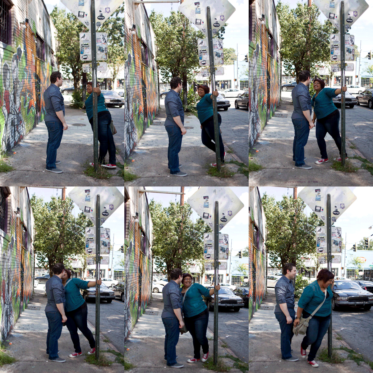
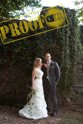
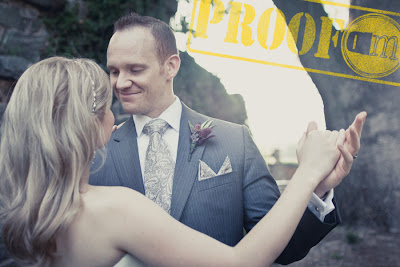
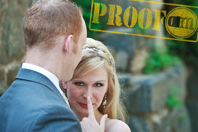
. . .here is my new home page:
With a little further explanation:
There are two things you may have noticed first. Artistry in Focus has been changed to Abra Michelle Photography.
Why, you may ask?
Well, to be honest, I came up with Artistry in Focus for a reason that is totally irrelevant now. When I first started this blog was about the same time I opened my (now dormant) Etsy shop. At the time, I was still working a full time white collar job trying to get my creativity in any way I could.
SO, I opened up an Etsy shop in order to sell my photographs and jewelry. The name Artistry in Focus was born because I wanted it to encompass all forms of craft that I happened to dabble in. My intention was a play on words. I stuck with that name for the past two years or more but over the course of time, as I concentrated more on my number one passion of photography, I realized that name no longer meant the same for me.
Not only that but my name is something I have come to be very proud of. I love how unique it is. It has become a major identifier for who I am. With that being the case, why wouldn't I proudly own a business with my name on it?
The Michelle is also tacked on there to make sure that people know I am a girl. ;D
So that's most likely one of the first things you noticed. Technically, I could have left the other thing alone because this:
. . .is actually the letters A and M the way I initial things in person. However, I didn't feel that was clear to all AND I wanted something a little more representative of me and my personality. I kept the basic design element that my dear friend Ryan (
see here) came up with with the repeating circles I just made a few changes that I felt was more. . .
me.
What I did was create an inspiration board from my
Tumblr and
Pinterest accounts, a la
Promise Tangeman's advice, and examined what stood out to me the most and really seemed indicative of who I am. What I noticed was a lot of circles, nautical stripes, repeating lines, YELLOW, and weathered wood among a few other things. Can you see that above? I also like things to be asymmetrical (you should see the jewelry I make) so I have the background reflecting that.
Even though I am a font junkie (
dafont.com is AWESOME!!!) and I played around with quite a few font choices, when it comes down to the standard fonts used, I prefer Times over Arial. So, in light of that fact, I decided to stick with Times so that it was easily legible and user friendly.
What you may also notice throughout my site is that I am stressing how much of my work is truly about storytelling. When Spencer and I sat down to discuss and dissect my business we realized how much of what we do and what we
love about what we do is the fact that, in essence, we are historians, documenting pieces of our client's lives.
This is going to sound odd, but one of my favorite compliments is making someone cry because she loved how the pictures showed her, her son, and husband playing together. Can you imagine years down the road when he's grown, looking at those same images and a smile can't help but come to his face? Imagine how much more meaningful that is if something happens to his parents and that photograph becomes one of his most cherished possessions of a time when his memory can't recollect?
Okay, okay, I got off on a little tangent there, but you get my drift. That is what I
LOVE about what I do in a nutshell.
Well that's that. I really hope you like the direction I have decided to go in. I feel it reflects me so much more so that when you meet me you feel like you know me a little bit already. I would love to hear your feedback and thoughts about all this.
Thank you all for your love and support.
Looking for a photographer of your own? Please contact me and we'll talk pictures. . .
or feel free to look at more of my photography online. . .
